
A Fine Line: Drawings from the Collection.
During a trip into town a few weeks ago I went to this drawing exhibition in the Leeds City Art gallery. I remember enjoying some of the work but with the lack of leaflets about the exhibit or any hard info online, I can't remember who's work was being displayed so.. I can't go into much depth about what I saw, only that I had been. The work was varied, covering anatomical work to cubism but the one piece which sticks with me is that of a map of the globe, drawn onto silver paper using silver pen which meant that you either saw nothing at first glance and ignored the piece or you caught a glimse of what was really there and unintentionally ended up spending a fair amount of time shifting your position in order to properly view what was going on.
Manga exhibit/Urban Gardens: Urbis
I spent the better half of a day getting to and from Manchester and wandering about the city to see an exhibit I'd been told about by a friend at the Urbis. I had missed the D&AD exhibit of previous professional winners by a couple of days but the exhibit on the influential force that is 'Manga culture' was in it's infant weeks of exhibition.
I'll start out by saying that I wasn't impressed with what I saw, especially after spending £14 on a ticket just to find that out.
The unique graphic art-form of Manga is explored through its manifestation in everyday life in the 21st century at this new exhibition on our first floor.
The exhibition explores Manga’s influence in shaping contemporary culture, with something for everyone, from kids to adults; it offers a whistle stop introduction to Manga for novices as well as plenty to keep hard core fans immersed. Visitors will discover Cute Manga, Action Manga, Manga in Art, Fashion and Design, Manga as communication and Erotic Manga – for over 18s only!
(The blog is STUCK IN ITALICS and now probably bold so.. you'll have to put up with this.. sorry)
So, the passage above is an accurate enough description of what the exhibition was about so I'll try to stick to what my beef with it was.
1. The exhibition gave a broad platter of the influence the 'Manga' explosion has had on the way everyone else works but.. the actual origins or direct influences were thin on the ground. There was alot of end product but little source material or much description at least as to how the transition was made between the two.
2. This lack of information was again evident in how some of the sections like the 'taboo adult' section were described when talking about the original source material; in this case, erotica and pornography but still original source. It seems throughout much more time was spent lavishing over what was created on the inspiration of these sources rather than these all important origins and as a result, you get this hollow feeling to the whole setup. Everything ends up feeling.. isolate and without a real purpose or identity.
3. Speaking of 'hollow work', very annoyingly most of the exhibit seemed to be full of (I hate to use such a term but) plain soulless images from artists like Tado, Kamitora and the makers of the godawful Shakespeare mangas. Especially frustrating was Tado's appearance as the teams work was round every turn, as if they'd sponsered the exhibit or something.
I say soulless because, most of the work that was on display seemed to have been created by artists who like me in my younger days, were fascinated by the beauty and surrealism of manga but didn't understand the culture behind it at all. As a result, you get some very skillfully 'illustrator'd' work
 like this
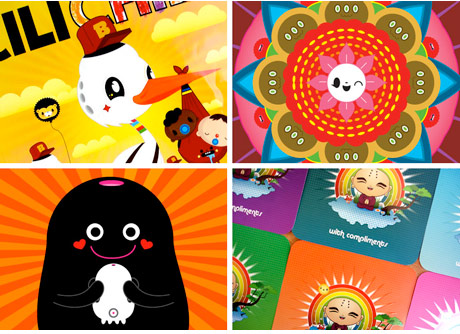
but... it feels empty and meaningless as the artist is unable to make use of the symbols and codes which the underlying culture has programmed the original source artists to be able to use. Some of the Tado stuff I admit does work on its own as some kind of bastardisation of french and japanese illustration but work like the shakespeare manga for example, is just inexcusable.

In manga, there are reasons that someone will be dressed in black, as a school girl or why their faces are concealed at any time and someone who just reads mangas without absorbing any of the background culture will only pick up a sketchy idea of why this is and you get this adolescent-appeal-only mess of crap; material that only someone who is just getting into popular manga would like and are probably about 13-15. Again its well drawn, it's just.. a cultural void; capable of holding neither the weight of shakespeare or of centuries of encoded symbols.
4. Which brings me to my last point about the exhbit in that this exhibition doesn't cater to someone who has disgested enough of this western-fumbling of manga and wants to know about the good old stuff or where it came from in any depth. It felt very childish; aimed much at the young pokemon or maybe naruto-watching audience and was ultimately unsatisfying.
I then went upstairs to the second floor and enjoyed an amusing documentary called 'allotment secrets' by Mary Culhane which I've been unable to track down online for you to watch but it's about the hints and tips other allotment-growers give to newbie owners so that they can get a good start on their growing. I like to learn and the quick and digestable manner in which these secrets were presented was amusing. Still.. didn't quite make up for the money I spent to see the exhibit..
After thumbing through Grafitism and some independant illustration journals in a store off picadilly square, I walked into Starbucks to steal some sugar packets for the train ride home, I ran into this beauty of a leaflet and stopped in my tracks.

(I would recommened clicking on this image for bigger.)
I think its the combination of the coffee palette with a simplistic drawing style that makes this image appeal so much to me. And that I found it in a coffee shop was even better; this should have been in the manga-influenced exhibit as a piece of illustration in action rather than the endless stream of Tado work.
Look & Listen Outdoor exhibit

In conjunction with the VJ group look&listen one of my peers Liz Ainge ran a van around at least two points in leeds in a van showing off local VJ talent such as CalTV and myself and my friend Matt's work.

TEH VAN. Or very similar to what it looked like. Just imagine it was a VW mini van with a battery and projector and it becomes a much more accurate image.
It was a chilling (in a good way) experience to see our work up there with about 50 people eagerly paying attention to it and this is definatly something that I would be interested in participating in again. Now to just make something to show for the next one...
(Caltv's bridging vj piece from the night)
Burning Candy: Tek33, cyclops and Sweet toof @ LCAD
On May 16th, James Jessop and his friends 'Sweet Toof' and 'Cyclops' came to our college to unviel their exhibition for us to gawp at. And gawp we did. This exhibit really whet my appetite for graffitism, or its sparked my interest at least as the concept of art out in the open became a reality to me like never before. I really liked the idea of just... doing it. Just going somewhere and knocking a piece up and not caring for authority. REBELS! Though I probably wouldn't take it to such an extreme (being a tepid character and all), I can certainly see myself clambering onto roofs and over fences this summer and painting dogs and tanks everywhere..
As a side note, I found Jessop to be a really.. annoying personality. I loved his work but I kept wanting to just.. pow.. jaw him with his lazy southerner drawl. I'm a very passive aggressive person though.
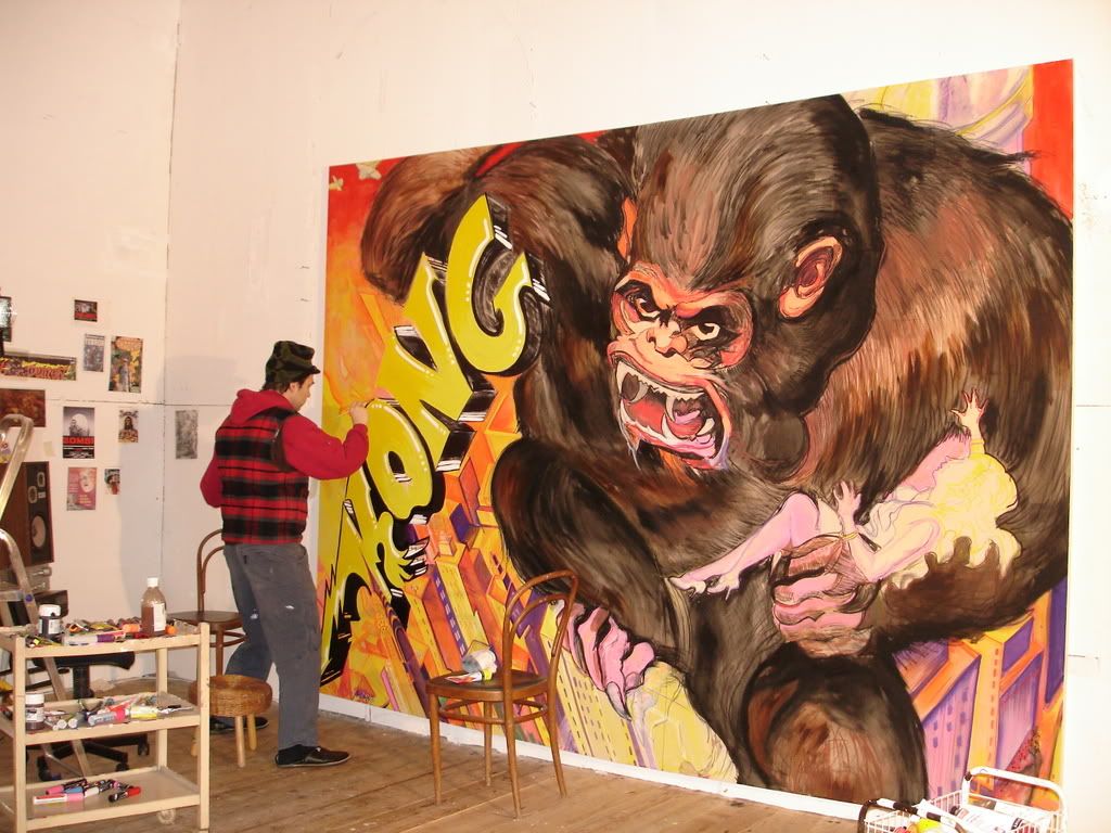
This was by far my favourite piece of Jessops; really well structured and detailed and a classic subject to work on. Beautiful stuff. This is an unfinished work in the photo by the way, I can't find a finished version of the piece at the moment because it was only unveiled recently.
May Art Week: Lifton three by four
As I walked back from Morrisons just over a week ago, I came upon an exhibit being held in the Leeds Uni campus called Lifton 3x4. There was a free piece of cake ladled into my sweaty mitts so of course I was happy and then I waddled on into the shabby house where all the art were was at.
I ignored quite alot of the work in there because it was centred mainly around nails hammered into wellies and taps. Well, not all of it was but I wasn't in the mood for conceptual art at the time.
So I honed in on the work of Louise Thomas and her postcards based on 'the last Shangri-la'.

Some of the cards were prints of patterns inspired by this asian culture and I bought a few for my textiles friends, but this sample in particular took my interest because its monoprinted and because the layout and contrasts of light are striking to me. Its kind of like a harsh reality version of a postcard you might send home on holiday. (I know.. no one does that anymore).
So yeah, for now that is a good summation of where I've being mincing about in the art world recently. Apart from borders and the library, but I'll get onto that.


No comments:
Post a Comment